Program dashboard for Booking.com's exclusive partner program

"Preferred Partner" is an exclusive status offered to high-performing properties.These properties get extra visibility in the search results and an exclusive badge. Because this was a partner-facing project, I have blurred the header to hide sensitive information, used mock data and discuss the external parts of the project.
Responsibility
I worked within an agile team of six. My role was to lead the design strategy with support from the Product owner and collaborate with various stakeholders to drive the project from understanding to go-to-market.
Understanding the paint points
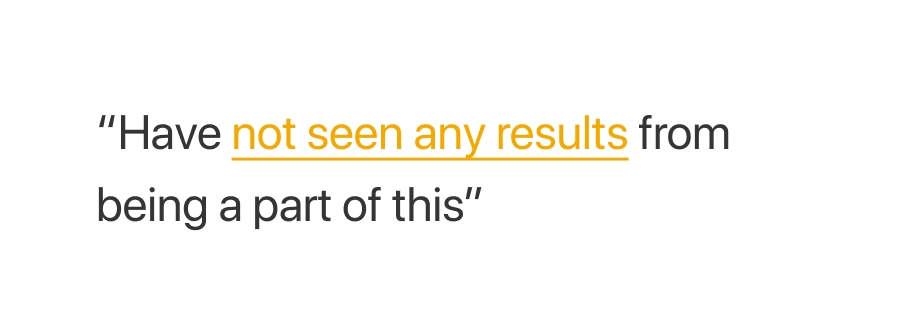
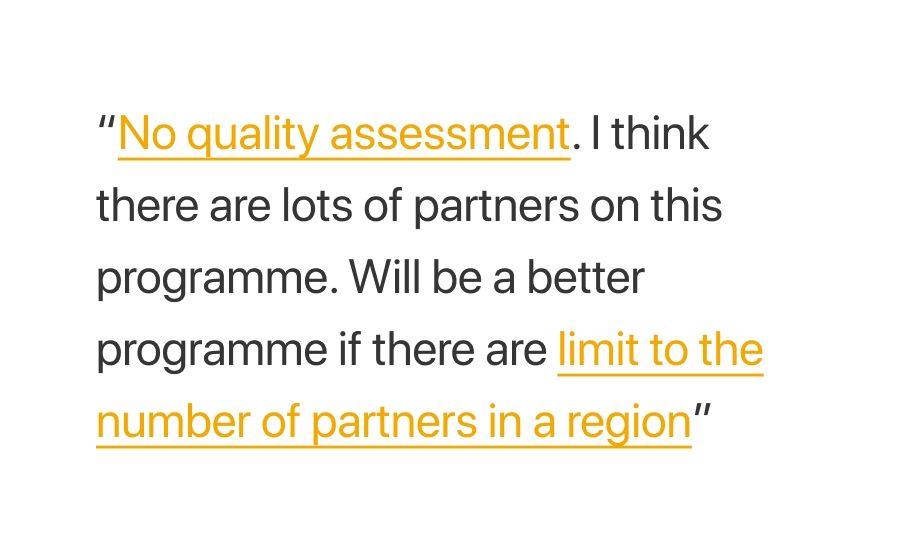
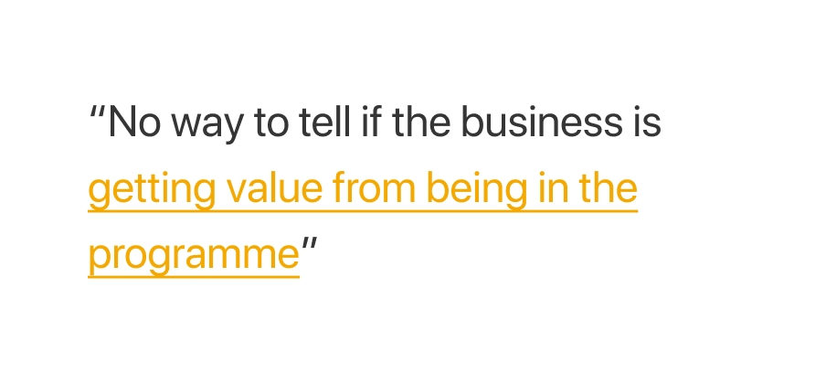
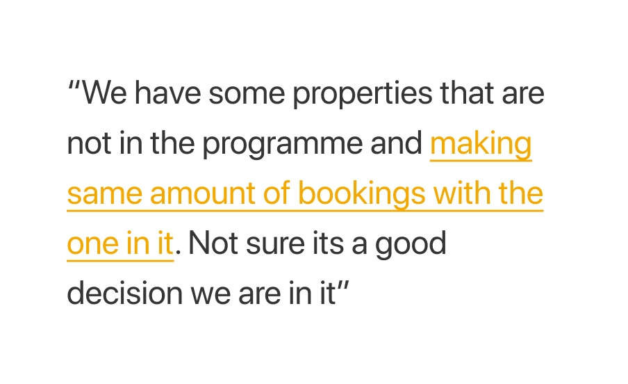
From our awareness survey reports, we understood that quite a large percentage of preferred partners were not aware of the value the program brings to their business.
In order to dig deeper into the root of this problem, we conducted an evaluative research to understand partners' current experience with the program.
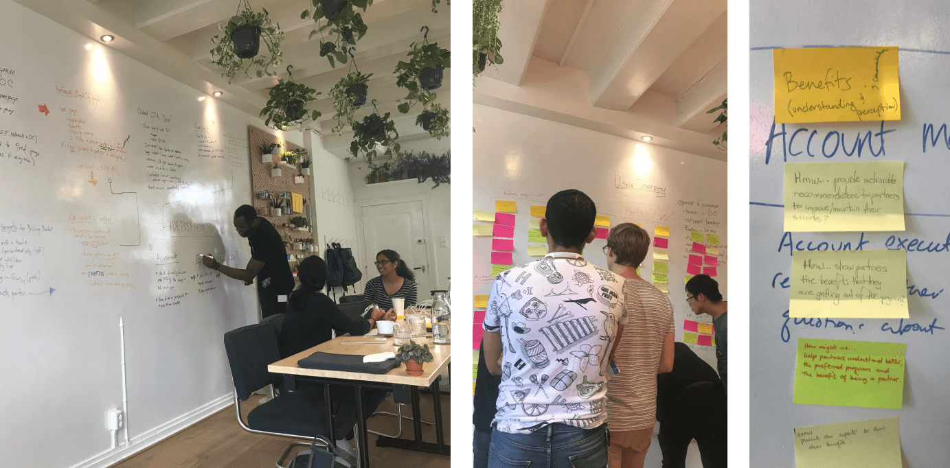
Design Workshop
Armed with our research insights, we organized a design workshop to explore various ideas on "How might we help partners understand the added value the program brings to their business". At the end of the workshop, We were able to converge on a proposed solution.

Ideation Phase
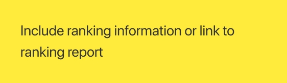
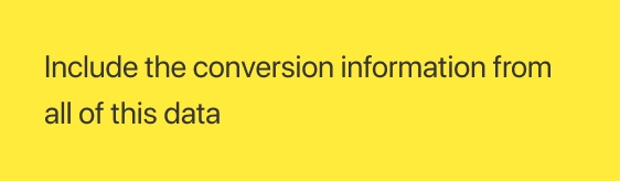
In the next workshop, we dug deeper into what relevant data we believe will help our partners understand the programme better. Each participants pasted their post-its and explained the ideas to the rest of us. Afterwards, we did dot-voting on the post-its to help us converge on one proposed solution.

Initial sketches
At this stage, we believe we have sufficient concrete ideas to design. I started exploring ideas on paper and then turned those into wireframes. The aim was to create a quick first draft that can be tested in the partner lounge. This is a co-creation platform where we are able to ask select number of partners feedback on our ideas.

Partner understanding & perception
I created the first draft of the design and shared with the rest of the team and other stakeholders for feedback on the direction. I collaborated with both ux writer and marketing manager on the content. Took the mockup to our design critique session for feedback from the rest of the ux community in preparation to test with the partners.
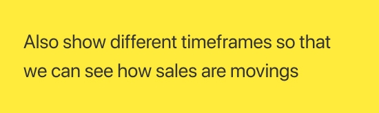
The goal of the research this time was to understand how partners perceive the proposed solution. We got valuable feedback that helped us further refine the design of the dashboard.
The solution
We refined the initial designs based on all the feedback we've got from our partners and also internally from the UX community. Also prototyped some of the interactions to help collaborating with the engineers easier.


Measuring Success
With the pain points in our minds, we believe the best way to measure the value of the dashboard will be to monitor partner churn. We also believe the next awareness survey will show improved result if our solution worked. We continued to iterate on the dashboard based on feedback from partners, Introduced new changes and updates using our internal a/b testing platform.